


Sunday, August 31, 2014
Watercolor in the Wild--New Reviews
"Watercolor in the Wild has been getting some wonderful reviews. Here are some excerpts:

"...His approach is very interesting. For a start, he allows himself about an hour for a painting. Each demonstration here – there are six, covering buildings, animals, people and landscapes – is edited down to about fifteen minutes and covers all the important bits without leaving you thinking, “hang on, what did he do just then?”. He begins, conventionally enough, with a pencil drawing, but then spends the next thirty to forty minutes putting in tones, values and shading. With a quarter of an hour or less to go, he gets to the detail. That’s not enough, surely? No, not for fine detail, but the point is he’s working on very solid foundations: the subject has structure and substance and he doesn’t paint the detail at all, just suggests what the viewer should be seeing so that they create the finer stuff for themselves. It’s very subtle and, although not unique in itself, certainly unusual in combination with so much preparatory work."
"The exception to the one hour approach is a painting of a sleeping foal. Young animals are rarely still and only for short periods and this one is no exception. A large chunk of this section is taken up with watching the creature running round, interacting with its mother and eating. Finally, it needs a nap and we get to work. The point of this demonstration is to show how you can capture the essence of a subject if you’ve already understood it before you lift a brush. I like the fact that, once again, James doesn’t tell you this, but shows you."
"This is an exceptional piece of work and amazingly good value."

"Gurney has a relaxed, conversational demeanor throughout — almost as though you had chanced upon him painting, asked about his materials and techniques, and found him more than happy to oblige. This is, of course, a superb approach for an instructional art video.
"The video production values are high, particularly in reproducing the sketchbook pages as the paintings progress, with lots of close-up views that show the renderings in detail....
"...One of the great things about these instructional videos by Gurney is the wealth of supplemental material available on his blog. This includes relevant material from previous posts and directly related questions answered afterward, all with lots of links to materials suppliers and other relevant resources.
"I now have several books and videos by Gurney, as well as being an avid follower of his blog, and I find a kind of synergy between his instructional materials, in that there is a basic underlying philosophy and systematic approach that comes from his considerable experience. I, for one, am hoping Gurney will follow up soon with a similar video on his techniques for opaque water media (gouache and casein). In the meanwhile, I’m finding transparent watercolor more pliant than I thought I would."

Review from Jackson Sze
"Watercolor in the Wild affords us a privileged look into the working process of a modern day master. James Gurney will inspire you to go out and paint, to try and capture life the way an artist can.With thorough breakdowns of equipment and materials, any artist will be well informed about what he or she needs to get started. The demos are both exciting and educational. As a Landscape Painting teacher, I would highly recommend any artist to watch and learn from Mr. Gurney. Though painting outdoors can be challenging, having this DVD in your collection should provide a constant source of encouragement and motivation."
Jackson Sze - Senior Concept Illustrator at Marvel Studios
https://www.facebook.com/jacksonszeart

"Gurney is an experienced teacher and you can really see that come through here. He is thoughtful and informative, while being very brief and succinct. It's a great companion to his previous DVD “How I Paint Dinosaurs.” Read the rest—Dan Dos Santos, Muddy Colors Blog
"The video production values are high, particularly in reproducing the sketchbook pages as the paintings progress, with lots of close-up views that show the renderings in detail....
"...One of the great things about these instructional videos by Gurney is the wealth of supplemental material available on his blog. This includes relevant material from previous posts and directly related questions answered afterward, all with lots of links to materials suppliers and other relevant resources.
"I now have several books and videos by Gurney, as well as being an avid follower of his blog, and I find a kind of synergy between his instructional materials, in that there is a basic underlying philosophy and systematic approach that comes from his considerable experience. I, for one, am hoping Gurney will follow up soon with a similar video on his techniques for opaque water media (gouache and casein). In the meanwhile, I’m finding transparent watercolor more pliant than I thought I would."
Review from Jackson Sze
"Watercolor in the Wild affords us a privileged look into the working process of a modern day master. James Gurney will inspire you to go out and paint, to try and capture life the way an artist can.With thorough breakdowns of equipment and materials, any artist will be well informed about what he or she needs to get started. The demos are both exciting and educational. As a Landscape Painting teacher, I would highly recommend any artist to watch and learn from Mr. Gurney. Though painting outdoors can be challenging, having this DVD in your collection should provide a constant source of encouragement and motivation."
Jackson Sze - Senior Concept Illustrator at Marvel Studios
https://www.facebook.com/jacksonszeart
"Gurney is an experienced teacher and you can really see that come through here. He is thoughtful and informative, while being very brief and succinct. It's a great companion to his previous DVD “How I Paint Dinosaurs.” Read the rest—Dan Dos Santos, Muddy Colors Blog

"I highly recommend the affordably priced download for anyone who wants to learn more about achieving realistic paintings on location." —Read the rest—Marc Taro Holmes, Citizen Sketcher/Urban Sketchers.

“James Gurney’s latest instructional video, 'Watercolor in the Wild,' is an educational and entertaining trip into the mind of one of America’s most respected artist / illustrators." Read the rest—Darren Rousar, author of Cast Drawing Using the Sight-Size Approach

-----
To purchase the 72-minute video "Watercolor in the Wild":
HD download: (Credit Card) from Gumroad
HD download: (Paypal) from Sellfy buy
BONUS FEATURES (a half hour of additional bite-size inspiration)
DVD: (NTSC, Region 1-North America)
HD download: (Credit Card) from Gumroad
HD download: (Paypal) from Sellfy buy
BONUS FEATURES (a half hour of additional bite-size inspiration)
DVD: (NTSC, Region 1-North America)
Saturday, August 30, 2014
Karla Mialynne's Photos of Realistic Drawings

EDIT: There's an interesting debate on Reddit about the legitimacy of these images, with many people suggesting that they're not real drawings at all (thanks Soondaep).
See many more examples at Realistic Animal Drawings Surrounded by the Tools Used to Create Them (via Bored Panda)
McCauley Conner Exhibition
Yesterday the New York Times paid respectful tribute to illustrator McCauley Conner, even to the point of starting off the article by calling him "an artist."
 Mr. Conner is 100 years old and going strong. His paintings are being featured at an exhibition at the Museum of the City of New York through January 11.
 He never thought he'd live to see his work recognized in this way, but it helps that they're calling him "one of the original 'Mad Men'" —a reference to the popular TV series. The museum says:
"McCauley (“Mac”) Conner (born 1913) grew up admiring Norman Rockwell magazine covers in his father’s general store. He arrived in New York as a young man to work on wartime Navy publications and stayed on to make a career in the city’s vibrant publishing industry. The exhibition presents Conner’s hand-painted illustrations for advertising campaigns and women’s magazines like Redbook and McCall’s, made during the years after World War II when commercial artists helped to redefine American style and culture."------
Read the New York Times article on Mac Conner
Museum of the City of New York: Mac Conner, A New York Life
The exhibition is co-sponsored by The Modern Graphic History Library at Washington University in St. Louis and the Rockwell Center for American Visual Studies.
Friday, August 29, 2014
Macro Photos of Compound Eyes


Thursday, August 28, 2014
Hitting the road next week

I'm dreaming about the road, because Jeanette and I will be leaving next week on a car trip from New York to Wyoming and Colorado. As much as possible, we'll be taking the old highways through small town America, sketching as we go.

I'll be one of the guests at the SKB Workshop in Dubois, Wyoming, September 14-19. There will be a lot of plein-air, landscape, and wildlife painters there in an informal setting.

Also, I'll be traveling out to California in November as a guest of the CTN Animation Expo. I've visited once before, and it's a very interesting gathering of animation artists.
If you can't make it to either of those events, I'll be reporting along the way from the blog.
Wednesday, August 27, 2014
Sepia Wash Drawing
If you're experimenting with watercolor for the first time, a good way to get some practice is to do a study in sepia.
Here's a sketchbook page I did while waiting for a train in Italy about 20 years ago.
 |
| Parco della Montagnola, Bologna, Italy. Sculpture by Diego Sarti |

Most subjects will call out for a variety of handling, including:
1. Large flat areas, such as the background of this painting. (I did that to simplify, or I would have missed my train)
2. Wet into wet blends, such as the shadow in the lower right,
3. Drybrush, such as along the cat's shoulder and the rock platform.
(I missed my train anyway.)
Here are three tips:
1. Do a fairly careful graphite pencil drawing first. It's especially hard in watercolor to correct mistakes in the initial drawing.
2. If you need to erase, test the effect of the eraser on the paper on another page by rubbing the eraser on a patch and running a flat wash over that area. Some erasers leave behind a little oil or grease that can affect a wash. You can erase after the painting is fully dry and avoid this problem.
3. When you're ready to paint, make sure you have both a big brush and a little brush, and make sure your watercolor set has a mixing well in case you need to mix a large amount of wash. You don't want to have to stop in the middle of a big wash to mix more.


People through history seem to be conflicted about whether to call such a study a drawing or a painting, so they're often referred to as a "wash drawing." I love the fact that it's on the boundary line between drawing and painting.
Instead of sepia, you can use lampblack, ivory black, burnt umber, or Payne's grey, each of which has a slightly different character.
Watercolor in the Wild buy
Color in Sketching and Rendering by Arthur Guptill (1935) Highly recommended, and it hasn't been reprinted.
Tuesday, August 26, 2014
Don't throw out your old watercolors!

I use the new tubes for refilling empty pans. If the semi-dry ones are still squeezable, they can work even better for refilling, because they don't drip liquid. You can cut open the dried out tubes with a sharp knife. The pigment is often tar-like in consistency and can usually be scraped out with a palette knife. A little water pressed in with an old spoon is usually enough to reactivate them. If you're handling toxic pigments with your fingers, remember to wear gloves.
My jar of pans is a graveyard of colors I've dumped from sets because I wasn't interested in them. Sometimes I change my mind and give those refusés another try. Every six months or so, I change my palette selection to keep myself off balance.
If I'm sure I don't want an old pan color, I pry out the color so that I can fill the empty pan with a new tube color. After refilling it, I put it on the sill of a sunny window and let it dry out for a week or two. If it cracks after drying, just fill in the cracks with more liquid color and let it dry again (thanks Jobot).
To cure the pigment from drying too crumbly, add a little gum arabic to it. Gum arabic is the binder or gluey stuff that holds watercolor together. You can get it in powdered form
Check out my video:Watercolor in the Wild by James Gurney
Big post about materials
Monday, August 25, 2014
How do we move when we breathe?
(Direct link to YouTube video)
How does your body move when you breathe? Well, of course the rib cage expands and contracts, but surprisingly the movement is more up and down than it is in and out, says Michael Black, co-author of a computer graphics study presented at the recent Siggraph.
There are many more small but observable movements going on. The arms push out, the head goes back and forth, and the spine flexes. The movements are slightly different for "stomach breathing" compared to "chest breathing," something that singers are very conscious of. One possible flaw in the methodology of this study is that subjects were asked to "breathe normally," a sure way to make them breathe unnaturally.
Once you learn to recognize the subtle body changes that accompany breathing, you won't look at a posed model the same way, and you'll notice actors in movies controlling their breathing as part of their performance.
Animators will be able to input this breathing data with simple controls, including a spirometer, which records breathing volume. In the future, when actors record their voice parts for CG animated films, they'll be able to record their breath acting as well. That information will yield a more believable and lifelike performance, whether the character they're playing is a realistic human or a talking turnip.
The authors are: Tsoli, A., Mahmood, N. and Black, M.J.,
The paper is entitled: "Breathing Life into Shape: Capturing, Modeling and Animating 3D Human Breathing"
Sunday, August 24, 2014
Dinotopia at the Children's House

Dr. Jo Ann Leggett, director of the Children’s House preschool of Victoria, Texas recently completed a Dinotopia-themed project for the school’s summer program, and she sent some photos to share.

Dr. Jo says: "Children delighted in all the books," and they learned about geography from the Dinotopia map.

They tried "plank walking," a Dinotopia game that I introduced in "Journey to Chandara."


"Dinotopia is our 'most-looked-forward-to' unit at the school. Thank you for your inspiration," says Dr. Jo.
Thank YOU, Dr. Jo! If you're a teacher of any age group and would like to spotlight Dinotopia at your school, please write me a letter. I’ll be happy to send you a list of suggested games, projects, and activities, and I'll include a signed card to help you get the ball rolling.
Previously:
Dinosaurs Invade Millburn High School
Science, Art, and Fantasy (Elementary School)
Saturday, August 23, 2014
Trends in Painting Media
I was just curious, so I checked on Google Trends to compare relative search volumes for different painting media.

People search least often for the word "gouache,"(in blue) along the bottom. "Oil paint" (in yellow) and "acrylic paint" (in green) are two or three times more popular than gouache. Acrylic passed up oil in popularity about three years ago.
Interest in "Plein air" (in blue purple) appears to be very seasonal, spiking in the warm months.
"Watercolor" far surpasses the others. It sagged a few years ago, but it's rising steadily. The search volume may not translate directly to the popularity of the art medium. The spike at the red letter "K" is tied to a popular article about digital printing watercolors on fabric. The letter "B" aligns with a story about a photo-to-watercolor app.
Casein painting didn't register at all—which is one of the reasons I love it.

Edit--Here's a graph of the usage of those terms as printed in books in the English language courtesy the Google Ngram Viewer. (thanks, Piers!) The graph may be a little misleading because it only tracks the frequency of the use of those particular words or phrases. Oil is just assumed most of the time people write about painting.
Friday, August 22, 2014
Rousar Review of Watercolor Video


Many thanks to Darren Rousar, (painter, teacher, author, publisher, and expert on sight-size methods) for the fun review of "Watercolor in the Wild" on the Studio Rousar blog.
"Watercolor in the Wild" HD download: (Credit Card)
"Watercolor in the Wild" HD download: (Paypal)
"Watercolor in the Wild" DVD: (NTSC, Region 1)
And what's a feature without a Bonus Feature?
"Watercolor: BONUS FEATURES" (Gumroad via Credit Card)
"Watercolor: BONUS FEATURES" (Sellfy via Paypal)
More reviews here
"Watercolor: BONUS FEATURES" (Sellfy via Paypal)
More reviews here
MOMA Reframes Christina's World
Peter Perez, Foreman of the frame shop at the Museum of Modern Art, discusses the thinking he brought to the reframing of Andrew Wyeth's 1948 painting "Christina's World." (Link to video)
Thursday, August 21, 2014
Gustav Doré in Paper Cutout Animation
Lorenzo Papace and Vincent Pianina created this stop-motion animated film of Gustav Doré (1832-1883) climbing a mountain.
The film was made to promote an exhibition of Doré's work at The Musée d'Orsay earlier this year (Link to YouTube video)
via CartoonBrew
Color Corona from a Bright Sky

While I was painting this carriage house on location, I tried to convey the feeling that the sky was both very blue and very bright. I wanted to simulate an effect that I have noticed in photography, where a bright sky bleaches out the camera's receptors and then spills over into small forms, making them take on the blue of the sky. (Edit: one aspect of this effect is an axial chromatic aberration called "purple fringing.")
I painted a very light cool wash in the sky, and then laid in the turrets, tree trunks, and branches with a mid-range blue. I also used a blue-gray watercolor pencil for the branches.
The scene didn't actually look this way to my eye—the sky actually looked like a light to mid-range high-chroma blue, and the branches looked extremely dark. I had to consciously override what I was perceiving and paint an effect that I was imagining.


----
In case you missed the full-length video, here are the links.
"Watercolor in the Wild" HD download: (Credit Card)
"Watercolor in the Wild" HD download: (Paypal)
"Watercolor in the Wild" DVD: (NTSC, Region 1)
And here are the links to the additional 28-minute video, available only as a download.
"Watercolor in the Wild" HD download: (Credit Card)
"Watercolor in the Wild" HD download: (Paypal)
"Watercolor in the Wild" DVD: (NTSC, Region 1)
And here are the links to the additional 28-minute video, available only as a download.
Wednesday, August 20, 2014
"Fig" Newton, Carnival Worker
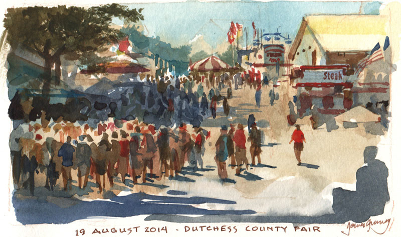
Yesterday I took my compact watercolor kit "into the wild" to the Dutchess County Fair in Rhinebeck, New York and painted an impromptu portrait of James "Fig" Newton, the oldest carnival worker at the fair.

 Fig is 71 years old. He has been in the carnival business for 48 years, working mostly in New York State. He has saved up money to help his nephew get started in glassblowing, and he just sent his daughter $500 so his grandkids could get outfitted for school.
He said when a family walks by he can tell right away who makes the decisions and who's got the money. Sometimes it's the dad, and sometimes it's the mom. I asked him if he had a good sales pitch to pull people in. "This game's not worth my barking," he said.

He was assigned to a ball-toss game in Kiddie Land. A bucket of ping pong balls cost five dollars. The goal was to toss a ball into one of the glass bowls floating by on little rafts in a circular wading pool.
The game looked impossible and nobody was going for it.
I asked him if I could sketch him while he waited between customers, and he was glad for the diversion.
He said when a family walks by he can tell right away who makes the decisions and who's got the money. Sometimes it's the dad, and sometimes it's the mom. I asked him if he had a good sales pitch to pull people in. "This game's not worth my barking," he said.
Every fifteen minutes or so a family would come up, pay the money, and a kid would toss the balls one by one.
Ping--Splash. Plip -- Splash. Dink, Dink -- Splash.
As each kid went away disappointed, Fig got up to his feet, leaned over the plastic pool, and scooped out the ping pong balls with a kitchen strainer.
The portrait took about an hour. I used watercolor and colored pencils, with a little gouache for the edge lighting, highlights, teeth and the blue collar. When I showed it to him, he shook my hand and said, "Good. You got my scowl."
Tuesday, August 19, 2014
Your Questions about Gear
Marque Todd says:
"I bought your WC video and have been avidly following all of the posts this week - a couple of things I am still grappling with for my kit and I hope you can answer:
"1) How do you protect your brushes from damage with all the jostling they get in a to-go pack? If they are loose in a container the tips can get damaged and that seems a pity particularly for expensive sable brushes. I am also having a problem finding something big enough for short handle brushes that isn't so long that it is hard to pack - any suggestions?"
Thanks, Marque. I keep my brushes loose in a box. The tips are safe as long as the box stays parallel to the ground, but in my belt pouch the box never tips on end. Sometimes if I'm worried about a delicate brush I keep the plastic protector from when it was new and slip that on. I keep the brushes all facing one end of the box. If one needs a good washing out later, I face it the other way in the box so that I'll recognize it right away.
I'm always on the lookout for a box that's just long enough for most short handled brushes but not too big, and one that opens quietly. If a brush is too long to fit in the box, such as an oil brush, I chop it down.

"2) If you are holding your sketchbook on your lap (vs. using the stiff board behind) how do you manage that with the landscape format? It is pretty floppy and somewhat of a balancing act. The only thing I could think of was to put a binder clip across the gutter/hinge area to help stabilize it."
I've used the binder-clip-across-the-spine idea, and that works fine. Otherwise I just try to rest the middle of the book's covers on the tops of my thighs to keep it from flopping. If I have to, I steady the book with my left hand.
Glenn wondered about the sketchbook pochade rig, asking if I countersunk the T- nuts (Those are the threaded nuts with a flange that fits through the plywood, holding it to your tripod.)
Glenn, Yes, I countersink the T-nut flange using a 3/4 inch spade bit, then glue the T-nut in with Gorilla Glue , so that it doesn't work its way loose. But since it's getting pulled tight from the back, it holds really well. If I was using 1/4 plywood for the backboard, I probably wouldn't countersink for fear of weakening the wood.

For you scratch builders, here's the pochade laid out flat. The red dots on the paint tray are magnet positions, which hold on the metal mixing trays or watercolor kits.

Here is the underside with two quick release plates attached. My new iteration of the rig has three T-nuts, one just right of center and one on each end. I use the central support point if I only have one tripod, and I use the two on the end if I need two tripods to keep the rig more stable when filming.
 Here's how the rig looks set up. Every angle and slope is fully adjustable: diffuser, sketchbook, paint tray, and camera bar. The camera I'm using is a Canon VIXIA HF
 series. It shoots 1080p to flash memory and has the all the essential features: focus lock, custom white balance, and exposure controls, plus an external microphone jack that yields less noise than my DSLR. For a mike I use the inexpensive corded Audio-Technica lav microphone
 , sometimes clipping it to the sketchbook itself to pick up the scratchy pencil sound cues.
 In this view you can see the two tripods. The diffuser panel, which is covered with white rip-stop Nylon, can slide right or left in its gripper to eliminate the direct sun. On the left is the Mighty Bright HammerHead Book Light
 , which clips on for night sketching.

And here's the the painting that's on the easel, the one that you can watch being painted in the "Watercolor in the Wild BONUS FEATURES" video, drawn with a brush and sepia watercolor in a museum.
 Here are the links to that 28-minute video, available only as a download.
"I bought your WC video and have been avidly following all of the posts this week - a couple of things I am still grappling with for my kit and I hope you can answer:
"1) How do you protect your brushes from damage with all the jostling they get in a to-go pack? If they are loose in a container the tips can get damaged and that seems a pity particularly for expensive sable brushes. I am also having a problem finding something big enough for short handle brushes that isn't so long that it is hard to pack - any suggestions?"
Thanks, Marque. I keep my brushes loose in a box. The tips are safe as long as the box stays parallel to the ground, but in my belt pouch the box never tips on end. Sometimes if I'm worried about a delicate brush I keep the plastic protector from when it was new and slip that on. I keep the brushes all facing one end of the box. If one needs a good washing out later, I face it the other way in the box so that I'll recognize it right away.
I'm always on the lookout for a box that's just long enough for most short handled brushes but not too big, and one that opens quietly. If a brush is too long to fit in the box, such as an oil brush, I chop it down.
Jeanette uses a brush holder made of stiffened fabric. The brushes tuck into elastic bands, and the whole thing folds open to display the brushes while you're working. When in transit it rolls up and is held with Velcro. I like it except that it's a little too long for my belt pouch.
"2) If you are holding your sketchbook on your lap (vs. using the stiff board behind) how do you manage that with the landscape format? It is pretty floppy and somewhat of a balancing act. The only thing I could think of was to put a binder clip across the gutter/hinge area to help stabilize it."
 |
| Sketching at Yellowstone with friends from the ASAI |
Glenn wondered about the sketchbook pochade rig, asking if I countersunk the T- nuts
Glenn, Yes, I countersink the T-nut flange using a 3/4 inch spade bit, then glue the T-nut in with Gorilla Glue
For you scratch builders, here's the pochade laid out flat. The red dots on the paint tray are magnet positions, which hold on the metal mixing trays or watercolor kits.
Here is the underside with two quick release plates attached. My new iteration of the rig has three T-nuts, one just right of center and one on each end. I use the central support point if I only have one tripod, and I use the two on the end if I need two tripods to keep the rig more stable when filming.
"Watercolor: BONUS FEATURES" (Gumroad via Credit Card)
"Watercolor: BONUS FEATURES" (Sellfy via Paypal)
And here are links for the main feature:
"Watercolor in the Wild" HD download: (Credit Card)
"Watercolor in the Wild" HD download: (Paypal)
"Watercolor in the Wild" DVD: (NTSC, Region 1)
Finally, three reviews:
"DVD Review: James Gurney’s Instructional Video 'Watercolor in the Wild'" by Marc Holmes, Urban Sketchers
"Plein Air Revolution" by Brad Teare, Thick Paint Blog
"DVD Review: Watercolor in the Wild" by Dan Dos Santos, Muddy Colors
"DVD Review: Watercolor in the Wild" by Dan Dos Santos, Muddy Colors
Subscribe to:
Posts (Atom)