Tuesday, July 31, 2012

Bata Shoe Museum


The Bata Shoe Museum in Toronto explores just one theme: footwear. 

The exhibits take up four floors of the museum, with displays showing the history and cultural variation of shoes, sandals, slippers, boots, and even snowshoes. 

Two strengths of the displayed collection are the footwear of Native Americans and fashion shoes from 1920-1950. 

The Native American room has moveable benches, but sketchers might want to bring their own stools for the other rooms.

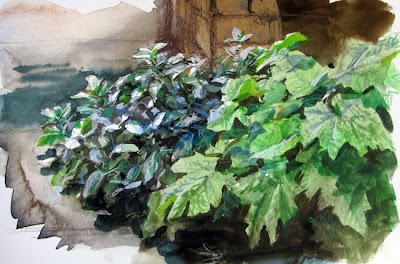
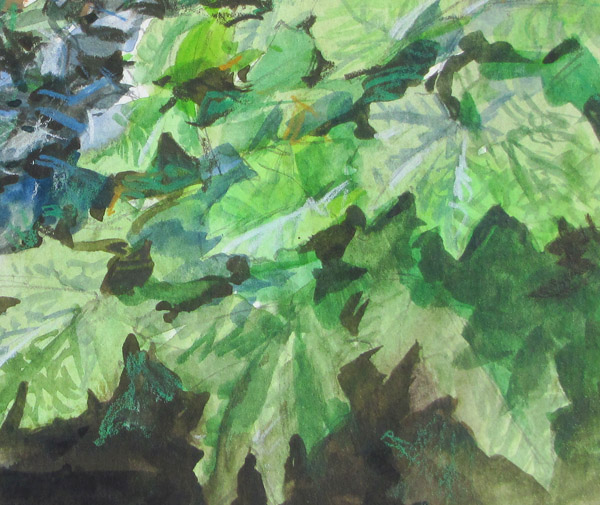
I drew the sketches with: Caran D'Ache watercolor pencils and a Niji Waterbrush in a Moleskine Watercolor Notebook.
If you go, here's a tip: Pick up a "second person free" coupon, which appears in the tourist booklets.

Monday, July 30, 2012

Savonarola


Girolamo Savonarola (1452-1498) was a Dominican friar who led a puritanical campaign against clerical corruption in Renaissance Florence.

His prophecies and protests led to him being excommunicated, hanged, and burned. 


I did this pencil drawing in London from a terracotta bust sculpted in the 19th century in imitation of a 1496 original. 


I was struck by the rugged vigor of his profile. I tried to imagine I was looking the real man instead of an echo in clay.

Sunday, July 29, 2012

Association of Medical Illustrators (AMI)

Yesterday was the last day of the annual convention of the Association of Medical Illustrators in Toronto, Ontario, Canada. I attended the gathering as a guest lecturer and workshop presenter.


(Above: Bert Oppenheim) The AMI includes professional visualizers who create artwork that shows what is going on inside the body. The artwork must be scientifically accurate and clear in its explanatory purpose, for people's lives often depend on it.

The images appear in textbooks, magazines, courtrooms, museums, digital readers, and doctor's offices. These days, most of the work is digital, including 2D, 3D, and animation. About half of the 2000 trained practitioners are self-employed.  

The field also includes paleoart and art for the veterinary sciences. Above is AMI member Dino Pulerá, MSc.BMC, sketching from a dinosaur fossil, photo courtesy Science Magazine.

Members have traveled from as far away as Russia to attend this convention, but most hail from the USA and Canada. The handful of universities that offer accredited graduate programs in biomedical illustration include Georgia Health Sciences University, University of Illinois, Johns Hopkins University School of Medicine in Baltimore, Rochester Institute of Technology, the University of Texas Southwestern Medical Center in Dallas, and the University of Toronto.

The training includes rigorous work not only in traditional and digital rendering techniques, but also in dissection and an array of life science studies. It's a very interesting field for young artists to consider if they are looking for something that combines art and science.

Thanks, AMI, for inviting me and for being such great hosts and workshop attendees!
----
Association of Medical Illustrators.
AMI's FAQ
List of graduate programs
Read about how Dino Pulerá turned his zoology major into an art career.
Previously on GurneyJourney:
Frank Netter's Medical Illustrations,
RIT Illustration,
Guild of Natural Science Illustration

Saturday, July 28, 2012

Big Ben in Scaffolding

Congratulations to all the people who prepared London for the successful opening ceremonies of the summer olympics.

Here’s a sketch I did of Big Ben back in 1985, when it was covered in scaffolding. (I’m a huge fan of scaffolding.)


Here’s a close-up detail. When I’m drawing a subject like this, which is infinitely complex, I try to be accurate but impressionistic, suggesting detail with somewhat abstract strokes drawn in perspective.

I used two hardnesses of graphite pencil, HB and 2B, as well as a little bit of light gray ink wash.
-
On Monday I'll be giving a talk on composition at the Academy of Realist Art in Toronto. July 30, 2012 @ 6:30 pm.

Friday, July 27, 2012

Russell Flint in Action

AN ARTIST aka SIR WILLIAM RUSSELL FLINT, RA


(Video link) Here's a film from 1956 of British artist Sir William Russell Flint, RA (1880-1969).


The film shows him laying out his watercolor palette, posing his model, and applying his wet washes. Flint typically worked from live models in his studio.


More about Sir William Russell Flint on Wikipedia
Flint bio on Jim Vadeboncoeur's website
------
On Monday I'll be giving a talk on composition at the Academy of Realist Art in Toronto. July 30, 2012 @ 6:30 pm.

Thursday, July 26, 2012

The Perfect Art School

The editor of American Artist magazine recently asked a group of artists, teachers, and administrators to describe "The Perfect Art School." The new September issue publishes the answers. 


Here's my answer: "The perfect art school would nurture skill but not ostentation, knowledge but not dogma, and tradition but not conventionalism."

Wednesday, July 25, 2012

Matania's Tone Paper Illustrations


Fortunino Matania was an Italian-born artist who created historical illustrations for the English magazines of the World War 1 era. Here's a picture he did of Captain John Smith captured by Indians.

Matania often rendered his pictures on a gray-colored board, which allowed him to develop the darks in pencil and ink wash, and to add the white areas with white gouache. The bright white of the pillow behind the sick girl really glows, and the solid black of the standing woman's dress provides an eye-catching shape behind the seated man. 


This one is called "Cagliostro: The Law of Trane" from Britannia & Eve. The tone paper technique is helpful for developing compositional sketches or for creating relatively quick renderings of complex scenes.

These images are all from the collection of Anthony Smith, who is offering them for sale on his Pinterest page. Thanks, Anthony.

Previously: Introducing Matania, showing his step-by-steps
Matania's illos of cross-dressing Mary Anne Talbot
Video of Matania at work
Matania's models and props

Tuesday, July 24, 2012

Measures of Greatness

According to an art history book published in 1904*,  Ernest Meissonier (1815-1891) would be remembered as the greatest painter of the nineteenth century. His paintings certainly sold for the highest amounts at the time


Other artists of Meissonier's time reflected on his greatness, though with amusing qualifications. Sir John E. Millais said, “He was more complete than any Dutchman.” Kenyon Cox said he was “The greatest genre painter of any age.” 


A book called "Modern French Masters*" from 1896 begins the section on Meissonier this way: "In Paris, a few years ago, twenty or more well-known artists were dining at the house of a prominent art dealer. During the evening the question came up: "Who, at the end of the 20th century, will be thought of as the greatest painter of our period?"


They posed the question fully aware of the fickleness of changing fashions, of the tendency of one generation to crush the idols of those that came before.


So who did this panel decide would rule 100 years later as the greatest painter of the nineteenth century? 


"The verdict of the jury was nearly unanimous that the paintings most sought after toward the close of the twentieth century would be by Bouguereau and Meissonier."


They chose Bouguereau because "his work is nearly perfect in its draftsmanship, the nude will always occupy a high place in art, and time will mellow much that is rather objectionable in its coloring."


Why Meissonier's pictures? Because they "are as nearly perfect technically as human skill can make them, because they are masterful in their knowledge, and because they are true in appearance."


Suppose we were to assemble a panel of experts today that included art dealers, art historians and artists, and suppose we were to pose the same question: Which artist of the twentieth century will be regarded as the greatest by people of the year 2100? 


It would be difficult for such a panel to come to any consensus. Before any names could be nominated, the criteria would come into dispute. How will future generations measure greatness? By what measure would we evaluate greatness today? No broadly based contemporary art panel would agree that skill, knowledge, truth, and perfect draftsmanship are valid yardsticks. 


The only objective criterion at a given moment is the economic yardstick of auction prices. But that's not based on any enduring principle, and the economic gauge is influenced by elusive market factors such as scarcity and promotion. Are artists great because they are expensive, or expensive because they are great? In any event, Meissonier and Bouguereau are proof that what has risen will fall, and what has fallen will rise.


If we rule out popularity or market value, then which criteria could we use? Beauty? Too subjective. The ability to transmit emotion? Too personal. How about: Audacity? Innovation? Novelty? Influence on others?


Perhaps we have to accept that the art world will be, for our lifetimes, divided into warring tribes, each with a different set of values. This state of affairs makes the job difficult, I imagine, for art juries, curriculum planners, critics, granting agencies, and museum acquisition committees. 
-------
Masters in Art: A Series of Illustrated Monographs, Issued Monthly. Bates and Guild Co. Publishers, Boston, 1904. 
Modern French Masters
Related book by Ross King about Meissonier and Manet: The Judgment of Paris: The Revolutionary Decade That Gave the World Impressionism

Monday, July 23, 2012

Painting the Chapel Garden


(Video link) Yesterday I did another little watercolor painting, this time of the garden beside the chapel at Bard College in New York.


I brought the video camera so you could follow my step-by-step progress — and witness the little accident I had halfway through. I caught it on video, but deleted the expletive.


This detail is about three inches across. Tools: Schmincke Watercolor Pocket Set 1-inch flat watercolor brushCaran D'Ache watercolor pencilsMoleskine Watercolor Notebook, and a 1/4 inch flat watercolor travel brush, shot on a Canon VIXIA.

The music was written and performed by John R. York, who is a long-time reader and contributor to this blog. Here's his website and his music page. The piece is called "A Lock of Hair," from his "Sketchbook" album. Thanks, John!

Check out my other videos or subscribe to the GurneyJourney YouTube channel so you can see the videos before anyone else. To embed this video in your blog, follow this link to the YouTube page, then press "Embed" and then "Share" and then copy the code right into your blog's composing box, and the video will appear on your blog.


Sunday, July 22, 2012

Photo retouching in glamour magazines


Photo retouching makes it possible to beef up a guy's physique or give a woman a wasp waist. The resulting images of models in magazines present impossible ideals for people. (Image above from Glamour magazine)

The teen glamour magazine called Seventeen has made a pledge to its readers about how it will and won't digitally manipulate photos of young models.

The magazine responded to an online petition by 14-year-old Julia Bluhm, who observed that many girls in her ballet class complained that they were fat.

Seventeen's pledge to its readers says that it will never change a girl's body or face shape, and will change only incidental details, like "flyaway hair," a confusing background, or an out-of-place bra strap. They set up a special blog that takes readers behind the scenes at photo shoots and shows the images before and after retouching.

The magazine "Glamour" has also responded to criticism, polling its readers about what how much retouching is good, and they produced a video where women answer the question "What makes you feel good about your body?"


Seventeen's photo shoot blog
Seventeen's Pledge
New York Times article 


Saturday, July 21, 2012

Overlapping


Elements in a picture look more natural and three-dimensional when they're overlapped. This painting by Henry Herbert LaThangue (1859-1929) suffers from a lack of overlapping. We see the shape of each goose pretty much in its entirety, just touching the next one. 


LaThangue commits the same foul in this picture, which is full of tangencies. A tangency is a point of contact between one shape and another so that they just touch without overlapping. The front goat seems to be nibbling the leg of the one behind it, and the third one back is nibbling the second one's shoulder. The effect of both pictures is awkward, flat, and spotty.

This painting by Charles Sprague Pearce (1851-1914) is much more successful in this respect. The sheep form an interesting mass, yet still have individual identity. Some of them are hidden behind the shepherd or partly cropped off the edge.
-----
Related post: Tangencies

Friday, July 20, 2012

Best How-To Art Books

The poll results are now final for the crowd-sourced list of best classic art instruction books. I asked you to nominate your favorite how-to books that were older than 50 years, and then you voted in a poll.

The top three slots are occupied by Andrew Loomis (1892-1959), whose drawing is at right. Loomis attended the Art Students League in New York, where he studied under George Bridgman. (Bridgman himself has two books himself in the top ten.) Loomis did a variety of story and cover illustration, but his upbeat, glamorous style was especially well suited to advertising illustration. He taught at the American Academy of Art in Chicago.

Loomis's books are practical, encouraging, well-illustrated, and clearly written, though some people have faulted the figure drawings for a lack of ethnic diversity—there really are a lot of 1940s glamour nudes in high heels.

All of these books were huge favorites of mine when I was an art student, except Successful Drawing, which I was unaware of at the time.


128 votes (39%) Available in a facsimile edition from Titan books.

108 votes (33%) Now out of print and expensive, but soon to be republished by Titan.

71 votes (21%) Available in a facsimile edition from Titan books.

70 votes (21%)

61 votes (18%)

60 votes (18%)

52 votes (15%)

49 votes (14%) 

(tie with above) Famous Artist’s Course by various authors
49 votes (14%) 

43 votes (13%)

41 votes (12%)

I feel like I should add a couple of titles that I didn't include because they came up after the nominations closed and therefore were not part of the voting. But they're also favorite classics: The Artist's Guide to Animal Anatomy by BammesThe Artist's Guide to Human Anatomy by G. Bammes and Drawing the Head and Figure by Jack Hamm. 
----


Thursday, July 19, 2012

Max Ginsburg workshop this September

Max Ginsburg will be teaching a three day workshop at Garin Baker's Carriage House Art Studio's "Visiting Artist Series this September 7-9. The studio is located in the Lower Hudson Valley of New York State. The workshop will focus on composing scenes with multiple figures.  


Enrollment will be limited to 15. Max will give individual critiques and studio time with live models. Garin's atelier is a congenial place to be during the work sessions and during the off-time, when students can bond around good food and conversation. There are rooms in Garin's historic house to accommodate some of the students.

Max and Garin have asked me to come by for an evening to talk a little about multiple figure composition. 

For more information: 

By the way, Garin and his studio are featured on the cover of the current issue of American Artist Workshop magazine.

Eternal life for a dead bloodhound

Sir Edwin Landseer (1802-1873) was the premiere painter of dog portraits of the nineteenth century. Jacob Bell, aware of Landseer's reputation, commissioned him to paint his favorite bloodhound, Countess. But Landseer took a long time getting around to the commission.


One Sunday evening the dog lost her footing on a second floor balcony and fell to her death. The next morning, Bell carried the carcass of his beloved pet to Landseer's door and knocked. He knew that Landseer was busy and hated to be disturbed.

Seeing the dead dog, Landseer declared, "This is an opportunity not to be lost. Go away. Come back Thursday at two o'clock."

Landseer arranged the dead dog in a sleeping pose as he was accustomed to do with his anatomical studies. When Bell returned at the appointed time, the portrait was finished. 

Richard Ormond, in his well-illustrated biography of Landseer, observes that "There is more than a hint of rigor mortis in the dog's stiff legs, and a general air of decrepitude not inconsistent with death. The atmosphere of the picture, with its dramatic contrasts of light and dark, is somber and haunting. Landseer's sympathy with his subject has an elegiac quality, a lament for death and old age in general."
------

Wednesday, July 18, 2012

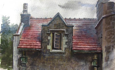
Painting the Gatehouse Window

Since you all asked for more, here’s another minute-long process video that I shot a few days ago. 


(Video linkThe subject is the Ward Manor gatehouse at Bard College in New York.


The basic procedure is to paint softly and loosely with a big brush in the early stages and then switch to smaller brushes and colored pencils for the smaller details. There's a little bit of gouache for highlights and corrections.
------
More about the architecture of Bard College
Antique photo of the gatehouse
Here are the tools I used:Schmincke Watercolor Pocket Set 1-inch flat watercolor brushCaran D'Ache watercolor pencilsMoleskine Watercolor Notebook, and a 1/4 inch flat watercolor travel brush (don't know brand).
See other videos or subscribe to the GurneyJourney YouTube channel