Tuesday, January 31, 2012

Artist's Facial Hair Poll

It's time to vote for the artist with the best facial hair. The poll is at left.


First row: Aivazovsky, Courbet, Friedrich
Second row: Kahlo, Uhde, Dali
Third rowMan Ray, Steele, Dickens
Fourth row: Brancusi, Rodin, Meissonier

----Added later: Dali is the winner. Here are the results, with 519 votes:

Aivazovsky
  35 (6%)
 
Courbet
  20 (3%)
 
Friedrich
  13 (2%)
 
Kahlo
  86 (16%)
 
Uhde
  84 (16%)
 
Dali
  106 (20%)
 
Man Ray
  19 (3%)
 
Steele
  39 (7%)
 
Dickens
  15 (2%)
 
Brancusi
  15 (2%)
 
Rodin
  22 (4%)
 
Meissonier
  65 (12%)
------
Previous Post: Best Facial Hair
Blog on Artists' Beards

Monday, January 30, 2012

Bennett School for Girls

The Bennett School for Girls is a hulking ruin at the outskirts of Millbrook, New York. 
It flourished for a time, but eventually went bankrupt and was abandoned in 1978. 


Over the last 35 years it has gradually become swallowed up by vines. Sections of the roof and outer balconies have rotted and fallen.


Inside, the floors have collapsed in places, making it rather treacherous to explore. It was scheduled to be torn down last fall, but Millbrook is having a hard time figuring out how to come up with the money for demolition.
-------
Photo essay at Opacity.com
Photo of interior by Milfodd on Flickriver
Bennett College on Wikipedia

Sunday, January 29, 2012

Roadside Dinosaurs

Brian Switek, of the Smithsonian blog "Dinosaur Tracking," has gathered up photos of the "Best of the Worst Roadside Dinosaurs." 


This weak-kneed Corythosaurus (photo by Mark Ryan) is propped up alongside Interstate 15 near Victorville, California.

He looks like he's hoping to hitch a ride, and if that doesn't work, he'll just radio back to the orbiting cruiser to return him to Neptune.

Best of the Worst Roadside Dinosaurs

John Berkey in Illo 36


The new issue of Illustration magazine has just arrived, with a big, splashy article on the life and work of artist John Berkey (1932-2008), best known for his extravagant spaceships. 

Berkey began as an illustrator for Brown and Bigelow calendars, where he developed his signature style which combines deft realism with a baroque abstract shape-music playing on a smaller scale. 

The article includes samples of his work for the movies: Towering Inferno, Orca, King Kong (remake) and Star Wars. 

The magazine also features the work of Rose O'Neill. Besides creating the Kewpie doll icon which made her famous also surprisingly created images of sultry women and mythological figures. The magazine has 80 pages in full color and costs $15.00. 

If you can't find it at your local Barnes & Noble, comic shop, you can order directly from Illustration magazine's website.

The article is written by loyal collector and fan Jim Pinkowski, whose website shares the trove of tearsheets that he has collected.
Berkey's book, "Painted Space"

Saturday, January 28, 2012

Dinotopian Dragon

What would a dragon mask from Dinotopia look like if it was based on real dinosaurs?
--------
From Dinotopia: The World Beneath, page 67.

Warehouse find! New first edition copies, signed by the author, are now available for U.S. customers only from the James Gurney website
Also available from Amazon.com

Macro Photos of the Human Eye

When seen enlarged by macro photography, the human eye is an amazing landscape.

According to Wikipedia, "The iris consists of two layers: the front pigmented fibrovascular tissue known as a stroma and, beneath the stroma, pigmented epithelial cells. The stroma connects to a sphincter muscle (sphincter pupillae), which contracts the pupil in a circular motion, and a set of dilator muscles (dilator pupillae) which pull the iris radially to enlarge the pupil, pulling it in folds."


The features on the front of the iris include:

  • The Crypts of Fuchs are a series of openings located on either side of the collarette that allow the stroma and deeper iris tissues to be bathed in aqueous humor. Collagen trabeculae that surround the border of the crypts can be seen in blue irides.
  • The pupillary ruffs (crenations) are a series of small ridges at the pupillary margin formed by the continuation of the pigmented epithelium from the posterior surface.
  • The Circular contraction folds, also known as contraction furrows, are a series of circular bands or folds about midway between the collarette and the origin of the iris. These folds result from changes in the surface of the iris as it dilates.
  • Crypts at the base of the iris are additional openings that can be observed close to the outermost part of the ciliary portion of the iris.

------
Wikipedia on the Iris
Photos by Suren Manvelyen.

Thanks, Eric!

Woodson Museum show opens

The Dinotopia exhibition preview party was a big success last night at the Woodson Art Museum in Wausau, Wisconsin.


Today is the public opening to the exhibition. That's a resin model of the Protoceratops dinosaur Bix on display, made by Jim Henson's Creature Shop.


Link to video 

-------
Dinotopia: The Fantastical Art of James Gurney
Signed 20th Anniversary Edition of Dinotopia

Friday, January 27, 2012

Soulful Moment

“For a picture to be alive, palpitating, we must recognize the moment chosen by the painter as one which sums up the souls of those depicted, with all their former experiences.” 
—Ernest Meissonier (1815-1891)


Meissonier's painting Napoleon, Campaign of France, 1814 (click to enlarge) is from the Musee d'Orsay, whose website describes the scene: "The episode he has chosen, although it occurred after several victories, announces forthcoming defeats. There is no action or event, just an atmosphere of loneliness and despondency. The doubts and resignation felt by the officers and the troops are palpable and are opposed to the determination that emanates from the isolated figure of Napoleon. These feelings are accentuated by the color range: the whole scene uses brown and grey tones, subdued, deadened registers. The protagonists are not trampling virgin snow, but muddy ground."
------


Thursday, January 26, 2012

Wednesday, January 25, 2012

Digital Film Preservation

In the January 20 issue of Daily Variety, David S. Cohen discusses the growing problem of preserving digital films.  


(Above: Ironman2) While the film Hugo was a clarion call for preserving old analog films, it turns out that hanging onto digital film files may be an even bigger and more pressing problem.

The Academy of Motion Picture Arts and Sciences sounded the alarm in a new report called "The Digital Dilemma." The problem stems from the cost of preserving files, the fate of independent productions that haven't yet found distribution, the rapid changeover of file formats and software applications, and the sheer volume of data. According to the Academy, the total content associated with a single digital movie is well above three petabytes. (Each petabyte is a thousand terabytes or a million gigabytes).

Cohen writes: "Digital storage, be it on hard drives, DVDs or solid state memory, simply isn't on a par for anything close to the 100-plus-year lifespan of film. The life of digital media is measured in years, not decades, and file formats can go obsolete in months." 

"The best archiving solution today," says Cohen, "is to print out to film, ideally with a three-color separation printed onto black and white archival film. That's a very expensive solution."

The content at risk is not just the final film and the outtakes, but also the test footage, commentaries, auditions, and concept art. They all might suffer the same fate as the lost plays of Aeschylus, the paintings of Apelles, or the sand paintings of the Navajo.
------

Visual Effects on "Boardwalk Empire"

Brainstorm Digital created this video of visual effects breakdowns to show all the layers of elements that go into reconstructing a historical world on film. 


It's a good demonstration of the Emmy-award winning artistry of the people who work in compositing, an often-overlooked part of the visual effects industry that involves sophisticated judgments about edges, light, and color.

Tuesday, January 24, 2012

Best Facial Hair Nominations

Taking nominations for "Artists with best facial hair." 


Please include link-URL in your comment. We'll do a poll of the top ten later in the week.
-------
Left: Fritz von Uhde; Right: Salvador Dali.

Fantasy World Map

So that's why all the elves have been coming into Dinotopia. Cartographer: Danmeth.com


By the way, the current issue of ImagineFX magazine has a workshop that I wrote with 26 tips for making fantasy maps.

Monday, January 23, 2012

Still Time to Enter Spectrum

For those of you who paint or sculpt fantasy, science fiction, concept art, comics, or gallery work, don't forget to enter your imaginative works in Spectrum, the annual juried collection of contemporary fantastic art. If you've never entered before, I recommend it.

It's the annual that most art buyers look at, and if you get your work in, you'll be in good company. Some students have gotten their work in and it has made a big difference in their careers.The entry fee is low and there's no "hanging" or "publication" fee -- and if your work is accepted, you get the gorgeous book, called Spectrum 18: The Best in Contemporary Fantastic Art.


It's a great jury this year:
Scott Gustafson – Artist
Peter de Sève – Artist and film designer
Jeremy Cranford – Senior Art Manager/Blizzard Entertainment
Jon Schindehette – Senior Creative Director/Wizards of the Coast
Dawn Rivera-Ernster – Director: Talent Development & Recruitment/Walt Disney Animation Studios


Entries must be postmarked on January 27, 2012. I just sent mine in today.
----------
LINKS
Book: Spectrum 18: The Best in Contemporary Fantastic Art

Year of the Dragon

Happy Chinese New Year. Since it's the year of the dragon, here is a dragon painting that I did.


The oil sketch and finish are for a story by Lucius Shepherd about a dragon the size of a mountain. The painting shows him in late day light, with a little alpine village clustering around his jaws.

Sunday, January 22, 2012

Alaska Residency Opportunity

The U.S. Forest Service will be hosting an artist residency in Alaska called "Voices of the Wilderness" for nine days this summer.  

(Above: Previous resident Kathy Hodge painting at View Beach in front of the Harriman Glacier -- note mosquito protection.) 

According to coordinator Barbara Lydon, it will be an “opportunity for artists to accompany a wilderness ranger in Alaska for up to nine days.  Artists may travel by sea kayak, skiff, tour boat, foot, and airplane. They will be immersed in the wilderness in ways that few people experience. They will camp along intimate fiords, walk through towering rain forests, and have the opportunity to see whales, sea otters, bears and other wildlife. 
Postmark you application by April 20.

Saturday, January 21, 2012

Posing Animals

The best way to learn to draw and paint animals is observe them from life. But since they generally don’t pose, you’ve got to catch them sleeping, or hope they feel like standing still for a while.

Some of the great 19th century teachers organized schools that included painting animals, and they would often hire a farmhand to hold the animals steady. Heinrich von Zügel was photographed here with his students in Germany. 

According to his account, they spent their time “drawing and painting in the daytime and discussing and drinking until midnight.” His students made precise studies indoors in the winter. In the summer they went outdoors and captured fleeting impressions of Nature. But thanks to those farmhands, the cows held fairly still.
Paul Meyerheim (1842-1915), another great German animal painter, had his master students set up in a courtyard of the Berlin academy, where they worked on oil studies of a mounted horseman.


When I taught my creature design class a couple of years ago, I brought my neighbor's goat Billy, who stood very patiently for my students as they drew studies of him. Billy seemed to enjoy posing. The farmer, Lenny, knew he would. "He'll love the attention," he said, as I lifted Billy into our van.
-------
 Thanks my friends and blog readers Christoph Heuer and Christian Schierkamp, who are doing some terrific research on 19th century German realists.
----
Previously:
Day 3: Goat Day
Heinrich von Zugel
Paul Meyerheim

Friday, January 20, 2012

Ghillie Suit

A ghillie suit is a head-to-toe camouflage outfit used to disguise hunters, snipers, wildlife photographers, and paintball enthusiasts.


Also called a "wookie suit," "camo tent," or "yowie suit," typically they're a netlike base covered with scraps of frayed rope, mossy tendrils or leaves. They're far more effective than traditional patterned camouflage because they break up the outline of the form.

They're often used in forest or grassland environments, but they've also become popular for an amusement called "urban camouflage." 


(Direct link to video) A German artist recently hung out in an IKEA store in Stockholm wearing a ghillie suit made to blend in with a big display of colored paper.
-------
Wikipedia on Ghillie Suit

Thursday, January 19, 2012

Interview on WAMC

This morning I was a guest of Joe Donahue on WAMC public radio to talk about the new Calla edition of the 20th anniversary edition of Dinotopia. 


Here's the link to the WAMC page, where you can listen to the interview in their archives: WAMC: Dinotopia (2012-01-19)

Visually Similar

--Thanks to Courtney at Artist Daily for spotlighting this post in on Artist Daily--

For the last couple of years, Google has had an image search option called “visually similar.” This locates images that are related by their abstract qualities, rather than their associated keywords.

For example, here’s a painting from Dinotopia: Journey to Chandara called “Irish Elk,” showing an extinct giant deer in a high mountain landscape. The colors are yellow ochres and browns, along with pale blues. There are no greens and hardly any reds.


Google sifts through millions of images on the web searching for other pictures with related image attributes, and presents those that it finds "visually similar." In this case, the images all have the same basic color gamut, a cluster of warm colors combined with grays and blues. 

Presumably it selects other attributes, such as gradation, complexity, texture, and shape. Other visually-similar programs such as Piximilar do the same thing.

In the previous example, what I found surprising was that, except for the helicopter and the dog, the results are all food ads. Why food ads? I'm guessing that the curving vignette shape surrounding the busy warm texture associated my picture with the curving shapes of plated food. 

Here’s a sketch that I did with marker pens, a high contrast rendering of a man at a podium. 

Google’s search program yielded results with dark silhouettes (not surprising) but the subjects are mostly clothes that are symmetrical and laid out flat. I find this surprising. Why clothes? Why symmetrical?

Here’s another Dinotopia painting, a stone monument at dusk, painted in brown tones, with a golden sky behind and a few cool or gray notes for contrast.

What does Google’s algorithm think is similar? A lot of interior scenes. Why interiors? Why so few outdoor scenes or so few paintings? Perhaps the particular color ranges I chose for my gamut happen to match those of indoor photos with white balance problems. 

I find it fascinating that the results cluster around specific families of subject matter that are so different from the source image. Google explain exactly how their algorithm works, but it's fun to guess at it.

Anyway, searching for visually similar images is a great way to see our own color schemes from a fresh perspective. To use it, go to Images.Google.com and press the little camera button in the search window. You can upload any image from your computer, including one of your own paintings in progress, or drop in a URL address of an image you found on the web. 
----------
LINKS
Both paintings from Dinotopia: Journey to Chandara 

Wednesday, January 18, 2012

Reference Balls

Here’s visual effects wizard Wesley Sewell holding up two lighting reference balls during live action plate photography for the movie “Kingdom of Heaven.”

The purpose of those balls is to record the sources and distribution of lighting in the scene so that later on, the visual effects team can match the virtual lighting of the CGI elements that will be added to the shot. 


Why do they need those balls to know the lighting? Isn't it obvious by looking at the lighting on Sewell’s face? There’s a strong, warm, low light source from off to the left somewhere. 

But the mirror ball (also called a “light probe”) shows more. You can see that there are some thin high clouds near the sun diffusing the light just a bit, and the ground is a warm dirt color.  Those factors change the effect of light appreciably.

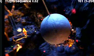
This shot is from the special effects company WETA Workshops’s model and miniature department. It’s a still frame from a test video sequence of a matte gray ball being “flown” through a miniature set of the catacombs of Orthanc in Lord of the Rings

In the frame at left, the ball is lit by a blue light from above, and a weaker orange light from below. During the test video, the lighting changed throughout the course of the fly-through. If you wanted to animate a digital creature flying into those caverns, the forms of the creature would have to respond to the same lights that are lighting the gray ball. Digital lighters can unwrap the data from the gray ball or the mirror ball into a spherical environment map.

Although I don’t use digital tools in my work, I sometimes adopt this trick when I photograph maquettes, because it makes it easier for me to reconstruct the pattern of light later on when I’m compositing various elements in the studio. This silver ball (an upended Christmas tree ornament) sits on a piece of kneaded eraser. It shows the illuminated wall on the left, the skylights and fluorescent lights on the ceiling, the greenish window light, and the sharp low spotlight. All these lights affect the way the forms are lit.

Here's another studio shot. This time there's no sharp spotlight; just the skylights and window light, and now my hands are a warm source of light bouncing into the shadows. 

The main point here is that lighting is more complicated than just "light and shadow." In every real-world situation, there are multiple light sources, each with different qualities of softness, directionality, color temperature, and intensity. Whether you use reference balls or not, the more aware you are of those light sources, the more convincingly you can paint or render each of the forms in your scene.

By the way, thanks for all your really helpful comments on yesterday's post about art instruction videos. I'll be reading all of them carefully --ALL of them-- before I put my video together.

LINKS FOR MORE INFO
Color and Light (signed from me) or (Amazon)

Tuesday, January 17, 2012

Video in the Works

I’m in the early stages of developing a full-length art instruction video, and I would love to have your input. 

Please let me know in the poll at left what you’d most like to see in a Gurney art video. You can vote for more than one thing on the list.

And in the comments, please tell me in general what you like in art instruction videos (OK to mention favorites or share links to YouTube samples), and what are your pet peeves (without mentioning specific names). 

What features should the video have? Do you like or hate background music? What’s the ideal running time? What makes you watch a video multiple times? What’s the most you’d be willing to pay? Would you rather have a paid download or a DVD?
------
Addendum, January23:

There were 753 votes in the poll "What should a Gurney art video include?"
Here are the results:

Case history of 1 or 2 paintings--240 (31%)
Dinosaurs / Creatures--158 (20%)
Research-- 257 (34%)
Thumbnailing--259 (34%)
Watercolor technique--268 (35%) 
Colored Pencil--124 (16%)
Oil technique--420 (55%)
Composition--429 (56%)
Making maquettes--238 (31%)
Lighting--377 (50%)
Photo reference--287 (38%)
Color / gamut mapping--312 (41%)
Brushes, paint, medium--286 (37%)
Time lapse--174 (23%)
Parakeet antics--171 (22%)
Oudoor plein air demo--251 (33%)

Monday, January 16, 2012

Really Rough Maquettes

How quick and rough can a maquette be and still provide useful lighting information?

The Oviraptor maquette on the left is sketched in plasticine modeling clay, with a marble stuck in for the eye. It took me less than an hour to sculpt. I set it up with a strong rim light and a weaker frontal light source.

You can see those two sources reflected in the eyeball, both in the maquette and the final painting.

I was looking for how the two sources would interact with the form. I didn't choose to follow the reference exactly -- I didn't bring the edge light as far into the form.

A maquette like this is not a keeper. The clay goes back into the primordial mud for next time.
------
More on maquettes in Imaginative Realism. (Amazon) (signed from my store)
The painting is from Dinotopia: Journey to Chandara (Amazon) or (signed from my store)

Sunday, January 15, 2012

Joan of Arc Video

Donato Giancola has released his second art instruction video, chronicling the creation of his recent painting of “Joan of Arc.”

The 4.5 hour production is the second by cameraman and editor Aaron Fagerstrom (previously they chronicled a science fiction painting called "The Mechanic."). It was shot over a three five day period in Donato’s Brooklyn studio, and unspools with Donato’s narration explaining his thinking each step of the way. 

The project begins with the artist explaining his inspiration for the character, who captured his imagination when he visited France a few years ago. He reviews a few pages of sketches on tone paper, explaining the concept and composition. 


He then reviews the results of his photography session with a model posing for Joan. As she gazes upward, a tight cluster of other figures, members of the clergy and nobility, tug at her and hold her down. 

Donato puts the photos of his models in Photoshop to form a large photomontage printed out at the size of the finished painting, and then transfers it down onto the smooth gesso surface and seals the surface to prepare for the paint.

This part of the sequence takes up the first hour. The remaining three hours follow his painting procedure. He is inspired by Peter Paul Rubens and Anthony Van Dyck, and he applies layers of semi-opaque paint over contrasting colors laid down in acrylic over the pencil drawing.


(Video Link) This trailer shows some of the artistry of the video, but Donato's spoken commentary is muted here, so you don't get the sense of Donato's encouraging explanation of what he's doing. The vibe is relaxed, friendly, and unscripted, and the sound and images are well recorded. 

If you play it in the background while you’re working in the studio, you end up feeling like you’ve spent a few days hanging out in the studio with a leading contemporary realist, who is reaching for great themes of history and imagination, and sharing the details of his process with the rest of us.  
---------
Video trailer