Thursday, March 31, 2011

Saint Louis Courthouse

Here’s a pencil drawing I did of the old courthouse in Saint Louis, from my hotel window.  It was a cold day, and across the street there were billows of steam pumping out of some ducts.


I was excited by the atmospherics, because the steam added life and mystery to what otherwise would have been a fairly ordinary architectural study. But I had to make sure to draw the whole structure and measure everything out before I covered it up. Some parts of the drawing are erased with a kneaded eraser.

Wednesday, March 30, 2011

Salt Art

Spill some salt, paint a portrait.
----
Via Best of YouTube

Who U Gonna Call?


Ghostbusters meets evangelism in this van parked along a road in Milford, Pennsylvania. I wonder what he keeps in there.

Tuesday, March 29, 2011

Value Planning

An art student recently asked me the following question:
 Dear James,
Some discussions I've been involved with lately have got me thinking about the relationship between color and value. Do you approach them as two different steps of a painting? For example some people see a well worked out monochromatic grisaille painting as perhaps the most important step in a painting, with the scumbled on color as an accentuating element. On the other hand some people have a more Alla Prima approach where they jump right into color, and create the illusion of "turning" surfaces and value directly through color mixing. How long do you spend on the monochromatic stage of a painting?
                    ---Pro Cedure.
   
Dear Pro Cedure,

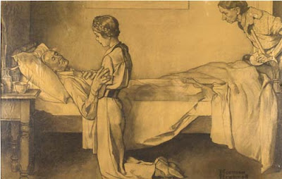
You ask a very great question color and value. Yes, I do think about the value structure as a separate step in developing a studio composition. I tend to do that thinking as a preliminary step in the charcoal or pencil stage. As I'm sure you know, Norman Rockwell was the king of planning the value design first in charcoal before jumping into oil (above: "The Ferry Story" courtesy of Heritage auctions).

Whether you plan the tonal structure as a separate study (as Rockwell, Cornwell, Lovell and many academics did) or whether you establish it on the final canvas as a preliminary stage of painting, either way it really is the foundation of a good picture. Color adds a lot, but it can’t save a bad value design.

And even with a thorough planning, you can still turn forms with color temperature as you suggested in your question. Rockwell is a good artist to study for that, and I believe many of his instincts for impressionistic color effects came from his study with Charles Hawthorne.

In my case with a fantasy or historical painting, once I have figured out the tonal design in two or three values as a separate step, I begin the layin or block-in. I don’t use a monochromatic grisaille but rather a limited palette of color, such as yellow ochre, burnt sienna, and ultramarine blue. The whole step should only take an hour or two.

My goal in the preliminary block-in is to establish not only the tonal statement, but also the big warm and cool relationships and the overall color mood at the very outset of the painting process. I stay well short of darkest darks, saving those for the finishing steps of the painting.

When working on location, or when painting the figure in under two hours, I am under shorter time requirements. So I often dive right in with color, but sometimes I do a quick pencil thumbnail sketch to plan the value design.

All the best, JG
----------
Related post on GJ: The "two-streams" hypothesis of visual perception
Recommended books: "Hawthorne on Painting"
"Rockwell on Rockwell"
I also cover this material in "Imaginative Realism"

Monday, March 28, 2011

Sky Conscious

Here’s a fine head painting by the American artist Harry Anderson, known for his illustration and gallery work in opaque watercolor, (also known as tempera or gouache).

Publish Post

Rather than point out all the excellent handling of edges and drawing, I want to point out the sky behind the head. It’s a very pale, low-chroma blue, almost matching the value of the light side of the form. What’s wonderful about the sky is how it steps back and provides a setting for the interesting area of the picture. 

Harry Anderson once said, “I imagine you might say that I am definitely sky conscious,”

"I can’t tolerate skies that force themselves on the viewer’s attention. Ordinarily the sky should be a foil for the rest of the design. It must retire, but many artists fail to grasp this truth. The source of light is always the lightest area in a picture. On a bright day this is the sun itself, when a white expanse in full light might be lighter than the sky, but on a gray day the sky is the source of light, and in this instance, the sky will be the lightest note—lighter even than pure white objects.”
------
“Harry Anderson Discusses his Painting in Tempera,” American Artist, May, 1956
See more Anderson images at Leif Peng’s “Today’s Inspiration” Flickr Sets.

Sunday, March 27, 2011

Lady Gaga, steampunk vampires, and fair weather painters

Last week, National Public Radio reported that the FBI has been reassessing its investigative methods after failing to anticipate the unrest in the Arab world. Instead of using just covert tools, they’re now turning to Google Trends, checking, for example, when Egyptians started searching the word “Tunis.”

Google Trends gives you a rough idea of what people are thinking about, based on how many times they search a topic. If you compare the graph of search volume for pop stars, it’s clear that “Lady Gaga” (orange line) has quickly risen far above either “Madonna” or “Eminem.”


All sorts of fantastic beings are hot right now, especially, “vampires.”
“Zombies” came back from the dead a few years ago, gobbling up “fairies.”


“Steampunk” is chugging steadily ahead. People run hot and cold on “plein air” painting, depending how nice the weather is outside in the Northern Hemisphere.
----------
Google Trends
NPR report

Saturday, March 26, 2011

Piggyback Sketching

English illustrator Harry Furniss (1854-1925) related this amusing incident in The Magazine of Art in 1888.

Once while covering a political event in Birmingham, his view of the speaker was blocked by a number of very tall gentlemen.

“Although close to him on the platform, I could not, being only five feet two, see over the heads of others when all stood to cheer. I mentioned this fact to my neighbor. ‘Oh, you must not miss this scene!’ he said, and quickly, without ceremony, he had me on his back, his bald head serving as an easel.”

----
Harry Furniss in Wikipedia

Friday, March 25, 2011

Kalalau Valley

One of the most secluded and magical places in the USA is the Kalalau Valley on the island of Kaua'i, It's the basin visible at the base of the sheer cliffs in this 8x10 inch plein-air painting from 2000.


No roads lead to the valley. You reach it by getting a permit and and hiking in along the narrow Na Pali trail, which follows the coast.

The mountain walls rise up almost vertically from the valley. It’s inhabited by wild goats and chickens, and a few campers. At times in its history it’s been the home of a small society of people living entirely off the grid, beyond the reach of law and custom.
----
Wikipedia on Kalalau Valley 
See a photo from the same spot

Thursday, March 24, 2011

Face Contour Tip

Royal Academy instructor Solomon J. Solomon (1860-1927) offers this trick for head drawing.
 
By holding the straight vertical edge of a book adjacent to the model’s face, it’s much easier to accurately judge the far contour of a face seen in three quarter profile.
 -----
Solomon J. Solomon, The Practice of Oil Painting and Drawing. Philadelphia and London, 1910.

Wednesday, March 23, 2011

Answers to your questions on "Moving Out"

Thanks, everybody for your interesting comments about the recent post “Moving Out.” It was a little experiment in form, combining a plein air study with fictional story. Sometimes I paint a house and think of it as a stage where a million private dramas are played out.


Tom, as far as the technical details, it’s in a Moleskine watercolor sketchbook, so it’s about 5 x 7.5 inches. I started with a pencil drawing and laid in an ochre undertone for the sky. I was going to going to come back with a blue wash, but forgot to, and liked it better warm.

I laid some color down over the whole surface of the paper, saving out the shining tarp and the little bit of snow by the fence, which were the lightest notes. In some of the early passes, I floated the dark tones for the windows onto wet paper to let them bleed into the surrounding tone.

Even after the first pass, the house needed to be “dirtied up” to look old. The truck was an ultramarine blue underwash with a semi-opaque light red laid over.  The tree branches are mostly drybrushed, with branches added in pencil. Mario, some of the fine lines (clapboards and wires) are drawn in with a Caran d’Ache colored pencils.

The whole sketch took about an hour and a half. In the composite at the top of this post, I stuck a photo of the subject at the right so you can see how the camera saw things. The far semi tractor-trailer in the photo was in motion during the photo. And the pickup really did leave halfway through, so I had to rely on memory to finish it up. I did all the work on location; I almost never work on a study after returning home because I feel unplugged from the inspiration.

Tuesday, March 22, 2011

Two Chinese Art Competitions

Two different international art competitions hosted by organizers from China are looking for submissions.


In “Share One Planet,” they’re looking for digital paintings of wild animals. I’ll be one of the judges. Arnie and Cathy Fenner of Spectrum will also be judging.

For oil painters, there’s another art competition called “American China Oil Painting League,” ACOPAL. Winning paintings will be exhibited in New York and Beijing. The deadline for that one is April 18.

----
Share One Planet
ACOPAL

Monday, March 21, 2011

Moving Out

The old house stood beside the railroad tracks. A satellite dish turned its ear to the dead sky. Some of the windows were covered over with clapboards, like blind eyes. A freight train rumbled by, screeching and grinding.


A man came out of the house. He lifted a TV into the back of the pickup. Then he loaded in a chair and a table. He stretched a black plastic tarpaulin over the load and tied it down, jerking the rope and muttering. The black tarp shimmered in the March sunlight.

A woman leaned her head out of the door. “Get lost,” she yelled. “I don’t care if I never see you again.” The door slammed.  A turkey vulture circled overhead.

I sat on the sidewalk across the street, painting quietly. Cigarette butts were scattered beside my feet.

The man got into the truck and started the engine. The train passed and the crossing gates lifted. The truck roared across the tracks.

A half hour later the woman came out, wiping her eyes with her sweatshirt sleeves. She walked by, pushing a baby carriage, slowing down a little to see what I was doing.

(Note--I did this painting on location last week, and parts of it happened--the action of the truck and the train and the vulture, but the human story was imaginary. Sometimes I can't stop my mind from overlaying a story onto a scene, and I'm attracted to sketching in bleak neighborhoods because of the strange glimpses of human existence I encounter there.) 

Sunday, March 20, 2011

Progress of Spring

Spring arrives today, along with the “supermoon,” the full moon in its closest approach to Earth on its elliptical orbit.


This is “Progress of Spring” (1905) by Charles Daniel Ward.

Saturday, March 19, 2011

Menzel’s Drawings

Nineteenth century German artist Adolf von Menzel (1815-1905) was a tirelessly curious artist who drew everything, from buildings to wagons to his own big toe. Here’s one of his late drawings, a study of an old woman.


“I never do drawings with a view to selling them,” he said. “As a rule I do them only as nature studies for a particular picture or as a casual thing for later use.”


His drawings often capture life on the run. “Art is a bolting horse,” he said. His pencil captured the tumultuous modern scene around him. He made many studies on location for a painting of the interior of an  iron rolling mill (link to painting). “For weeks on end from morning to evening I stood between the huge whizzing, oscillating wheels and belts with red-hot blocks, and sketched.”

“Art has kept pace with all the advancements and deviations of the development of the mind and will always keep pace with them, as artists, like mankind, are an integral part of this development.”

Quotes from Menzel by Bruckmann
Previously on GJ: Menzel: Beyond Appearances
Portrait of old lady from "The Later Work of Adolf von Menzel," by Jarno Jessen, Magazine of Art, 1902, page 49 
 Wikipedia on Menzel
Drawing of rolling mill worker from the Getty collection (which I believe incorrectly states that the drawing was not drawn on location. All the studies were done on site, according to Menzel's own letters.)

Friday, March 18, 2011

Blending Into the Background

Thin channels of snow linger in the tractor ruts on a clear March day.


After I painted the scene on location, I set up the painting in front of the scene itself, angling the painting to try to match the light levels.


Trying to match a painting up with a camera view was the challenge faced by pioneering movie matte painters. One early technique, called a “glass shot” involved painting part of a scene onto a pane of glass positioned vertically in front of a camera. That way you could place a castle or some other structure in the scene adjacent to the filmed action.

If you want to play with this idea, it helps to have a panel that’s a little wider than the easel (in this case an 11x14 panel on an Open Box M pochade easel).

Also, the illumination on the painting has to be just right. My painting is shown in direct sunlight, but I often use a white umbrella to diffuse and control the light on the painting, especially when painting contre jour (facing the light source). In any kind of observational painting it really helps in color mixing if you can match illumination levels as much as possible.


And speaking of blending in, check out how this Chinese artist does it.
---------
The second photo is of Paramount matte painting veteran Jan Domela setting up for a glass shot. You can read more about Domela at the blog Matte Shot

Previously on GJ:
White Umbrellas
Contre Jour Lighting

Thursday, March 17, 2011

How to get a feeling of misty light

This painting from Dinotopia: Journey to Chandara uses a simple device. The subject is placed in a high-key silhouette near the sun. The silhouette colors shift to warm hues as they approach the sun.


The color corona around the sun spills over and influences both the colors of the sky and the silhouette colors. The color mixtures are actually fairly low-chroma (not very saturated), but you can get a feeling of great brilliancy this way. This is very easy to do in digital, but it takes a bit of deliberate planning in paint.

A silhouette treatment is good to use in a sequential work like an illustrated book, comic book, or animated film, especially if you want to give the viewer a break from looking at a lot of detail.

Good rule of thumb: the most brilliant impressions of light are achieved in paintings when looking toward, not away from the light source.
----
Previously: Color Corona
Color and Light, page 166-167.
Dinotopia: Journey to Chandara

Wednesday, March 16, 2011

Mucha’s "Le Pater"

Half-naked figures prostrate themselves in misty gorges, struggling and writhing before serene spirits of light.


Among Alphonse Mucha’s greatest achievements in his mature years were his seven pictures from the Lord’s Prayer, known as the “Pater Noster” or “Le Pater.”

He created a separate image for each line of the prayer. Above are the images for “Thy kingdom come,” and “Forgive us our trespasses as we forgive those who trespass against us.”

Mucha visualized the familiar prayer as a universal expression of humankind’s relationship with the divine, mixing traditional Catholic devotion with an Asiatic-tinged occult mysticism.
 
Above: “Lead us not into temptation” and the cover.

The Century magazine in 1904 described Mucha’s unique conception of God as “no longer the benign or wrathful Father, but a mysterious Being whose shadow fills the earth. Nature is personified as a luminous, adolescent giant, and Love descends from heaven in the guise of a woman.”

You can see all seven images, as well as the decorative elements and calligraphy Mucha produced for the cover and the intervening pages at this website.
Quote from: “Alfons Mucha and the New Mysticism,” by Christian Brinton, Century Magazine, 1904.
Alphonse Mucha (1860-1939) on Wikipedia
Lines and Colors update on Mucha with a LOT of helpful links 
Good reproductions of all seven pictures in the Belvedere Catalog 

Tuesday, March 15, 2011

Disney uses lab tests to gauge response to ads.

According to Variety magazine, the Disney company is working with a scientific laboratory known as the “Disney Media and Advertising Lab” or “Ad Lab” to analyze audience response to the ads appearing on its networks.


The lab building, which does not include the Disney logo, is located in Austin, Texas. Scientists dissect biometric data about eye tracking (left image above), heart rate, and galvanic skin response to better understand emotional reactions to ad content. According to Senior VP Artie Bulgrin, these data are far more accurate than the self-reporting of questionnaires.

Another technique called “facial coding” or “facial mapping” (right image, above) tracks tiny movements of individual facial muscles. For the future, the scientists at Ad Lab are considering including data from brain wave analysis to better understand how people respond to ads.

The lab’s primary mandate is to study advertising strategies on behalf of ESPN, ABC, and ABC Family, helping those multi-platform media networks to coordinate better with their advertising partners.

Ad lab studies classic metrics such as unaided recall to novel ad strategies like live ads, split screen ads, banners, and transparencies, where ads are superimposed over content.

No word yet on whether the mouse house is using ad lab to pre-test its motion pictures.

 Adweek article on Ad Lab
"Austin to House Disney's Ad Lab"
Variety article: “Disney’s Lab Studies People” by David Cohen

Monday, March 14, 2011

Light Pillar and Sub Sun

A light pillar is an optical phenomenon that occurs when the light of the sun reflects off tiny ice crystals floating in the air, forming a vertical column above the sun.

It usually happens when the sun is low in the sky, and sometimes even after it has set.


Light pillars can also occur near the light of the moon or streetlights, as long as ice crystals are floating in the air near you.

Ice crystals are often shaped like tiny flat hexagonal plates. Like falling leaves, they tend to float downward with the flat surface parallel to the ground.


Sometimes you can see a reflection of the sun off the top surface of these floating crystals. Looking down from an airplane window, a “sub sun” reflection will occasionally appear in a region below the horizon underneath the sun.

In the case of the magnificent photo above, the secondary light effect is a sub-parhelion, more rarely observed. It's caused by light that reflects off of the hexagonal internal surfaces of the ice crystals.  
Wikipedia on light pillar
Sub sun image from EPOD.
Nice explanation with diagrams of the ice crystals on Weather Doctor

Pretty Darn Long Time Stamps


The U.S. Postal Service announced recently that all stamps from now on will be Forever® Stamps. The idea of a forever stamp is that “it will be good for mailing one-ounce First-Class letters anytime in the future. It’s good forever.”

But forever is a long time. The Earth won’t last forever. In about five billion years, the Sun will expand into its red giant phase. Its fiery perimeter will expand to about the orbit of Mercury, making life (and postal service) impossible.

What about the Forever Stamps then? Will they still be good? I don’t think so.

To be more accurate, why don’t we call them Pretty Darn Long Time® Stamps?
-------
USPS press release

Sunday, March 13, 2011

Stoops in Illustration

The new issue of Illustration magazine has a feature on Herbert Morton Stoops (1888-1948). Stoops had a long career in adventure and military illustration.


He painted covers for Blue Book magazine for 13 years. The article was written by Colonel Charles Waterhouse, USMC, himself a notable painter of military history.


Illustration #32 also has articles on “Ed Balcourt, Artist and Artist Representative,” and “The Artists of Alfred Hitchcock and the Three Investigators” which looks at the covers for a series of mystery books.

As always with Illustration magazine, the articles are lavishly illustrated with fine color reproductions, and you can preview the entire issue online.

Illustration Magazine
Flip-through of current issue

Saturday, March 12, 2011

Exploring Infinity with Geometric Doodles

Improve your doodling to the Nth degree by watching this video by Vi Hart.


Via Best of YouTube
Link to YouTube video
Vi Hart's Website, with other videos
Previously: Mathematical Doodling (knot theory)

Atmospheric Perspective in IA #77

The brand new issue of International Artist includes a feature that I wrote about the laws behind atmospheric perspective.
 
This is a basic principle used by every landscape painter, but there's more to it that meets the eye, so to speak. For example, the old rule "warm colors advance, cool colors recede" is only half true.

The article contains three images not included in my book Color and Light. Published for the first time is a plein air study from the north rim of the Grand Canyon and a Hudson Valley vista painted on location at Oak Hill.
---
International Artist magazine

Friday, March 11, 2011

Robots at the Rockwell

The Norman Rockwell Museum is looking for a few good robots. They’re hosting a juried exhibition on the grounds of the museum this summer. At this stage they want concept submissions for weatherproof outdoor sculptures.

The robot sculptures will be chosen by a three-person jury. The winners will be on display at the museum July 16 through October 31, 2011. The Rockwell Museum will also host a Steampunk Evening on August 4th.

There are awards: SuperBot Best in Show: $300, ArtBot: $200, ModBot: $200, ClassicBot: $200, SteampunkBot: $200, WowBot, Viewers’ Choice: $100, KidBot Children’s Choice: $100.

The drawing at left, “Stanley the Robot” is one that I drew in charcoal on vellum (inspired by Rockwell and George Bridgman) around 1979. Stanley is a pot-bellied fry oil steamer bot who came together out of spare junk thrown behind an intergalactic restaurant.

I’m too busy to build him, but if there’s a sculptor among you who wants to construct this design, send me an email (jgurneyart (at) yahoo.com) with a link to your portfolio. Maybe we can collaborate.

Application form, sketches, concept statements and fee are due by April 15.  Email questions about contest details to Thomas Mequita (tmesquita ( at ) nrm.org) Call 413-931 2278.

Link for more information

Dürer's Triumphal Procession

A modern presidential motorcade is a public demonstration of glory and power. Aside from the flags, the look is black, austere, and vaguely ominous, like a fast-paced funeral procession.


In the Renaissance they had a different notion of how to do a motorcade. Their style was extravagant, ornate, and full of symbolism, more like a float in the Rose Parade.


In 1518, Albrecht Durer worked with other wood engravers to portray a procession of the imperial family. Victory descends to the emperor with a laurel wreath, accompanied by cardinal virtues: Justice, Temperance, Fortitude, and Prudence. Feathers on angels’ wings list the victorious battles.

Thursday, March 10, 2011

Ernest Meissonier’s Costumes


----
From Masters in Art: Meissonier, by Gustave Larroumet, 1893.

Wednesday, March 9, 2011

Escher’s three worlds

M.C. Escher’s lithograph "Three Worlds" is a good illustration of the behavior of light on a smooth water surface.


At the far end of the pond, the water approaches the reflectivity of a perfect mirror because we’re looking straight across it at a very shallow angle. At shallow angles, most of the light bounces off the water (reflection) rather than angling down into it (refraction.)

At steep angles of view, the opposite happens: we see less reflection and more refraction. Therefore the water is dark and we see the fish more than the sky or the trees.

Wikipedia about "Three Worlds"
Color and Light, page 200.
Previously on GurneyJourney: Transparency of Water

Tuesday, March 8, 2011

Angry Animals

In Dinotopia, dinosaurs and humans humans get along most of the time. But not always.

If you drive a strutter through the Rainy Basin, don’t be surprised if you get attacked by a T. rex. (Image from Dinotopia: The World Beneath)

The same is true with animals in our world, as the following photos attest.


I don’t know the sources for these photos, so sorry, I can’t credit them. Thanks, Jim!
Video of World Beneath artwork with ZBS audio adventure

American Artist’s Plein Air Painting Issue


Spring is here. Get out your paints!

American Artist’s new special issue featuring on plein-air painting has just arrived on the newsstands.

The emphasis is on landscape painting from observation. There are articles about Scott Christensen, Clyde Aspevig, Chris Blossom, Clark Hulings, and others.

They asked me to adapt material from the Color and Light book for an article about sources of light, so I covered direct sunlight, overcast light, window light, candlelight, incandescent, fluorescent, and streetlight.
---------
 American Artist’s Plein Air Painting Issue

Monday, March 7, 2011

Three Years of Daily Doodles

Larry Roibal has been doodling portraits of famous people on his newspaper for three years now, and posting the results on his blog. 


To celebrate, he made a video mashup. The result is a fun experience of face recognition, and an impressive display of drawing.
Link to YouTube video
Larry Roibal's Blog

Exhibit: Illusions of Reality

An old man struggles to carry a heavy load of wood as his daughter (or granddaughter?) stops to pick flowers. It’s a simple and universal human story, painted with extraordinary sympathy and attention to natural detail.


This painting by Jules Bastien-Lepage is part of an exhibition at the Ateneum museum in Finland. The show includes paintings, photography, and cinema of the Naturalist movement.

The curator of the exhibition is Gabriel Weisberg, an expert on naturalism, and on the early uses of photographic references by 19th century painters.

“Illusions of Reality - Naturalist Painting, Photography and Cinema, 1875-1918” at the Ateneum Museum in Helsinki, through 15 May, 2011. According to blog reader Christoph, there’s a nice catalog, too.
-----
Thanks, Christoph Heuer
Ateneum museum
Bastien-Lepage on Wikipedia
More on current exhibitions of realist paintings at the excellent blog Underpaintings.